Tuesday, August 4, 2009

Bivariate choropleth maps


Bivariate choropleth maps show more than one variable, like in this example it shows the amount of violent crimes, rapes, robberies and murders in the US in 2003 vs 2004

Univariate choropleth maps

http://upload.wikimedia.org/wikipedia/commons/thumb/7/78/USA_states_population_density_map.PNG/800px-USA_states_population_density_map.PNG

A Univariate choropleth map shows only one variable, here the population per square mile by state is shown.

Data Visualization


This visualization represents NYT's box office receipts which include recent movies and how well they did in the box office. This type of visualization is easy to view and can portray the data in a more appealing manner.

Concept Mapping

http://ecrp.uiuc.edu/v8n2/birbili/images/fig2conceptmap.gif

This is a concept map, which is a way to organize ideas. In this concept map, the reason why trees are important is represented.

Interactive Graphics

http://www.cs4fn.org/fundamentals/images/ghostface.jpg

This is a form of interactive graphics, here they use the graphics to zoom in and out.

Textual Visualization

By using text, this is a visualization representing the similarities between the american and the chinese.

Lorenz Curve


This is a representation of what the Lorenz Curve does, and how it shows the inequality.

Index Plot


This chart shows the tempature of air, soil and wind in Davis CA using an index plot.

Population Profile


This is a chart that shows the population by their age.

Climograph


http://www.washburn.edu/faculty/tfry/Climate%20article_files/image003.gif

The graph shows a monthly depiction of precipitation and temperature conditions for Moscow Russia. You can see that the precipitation is shown by the bars and the lines show the temperature.

Line Graphs


http://www.mathgoodies.com/lessons/graphs/line.html

Line graphs are also another form of geovisualization, here the data of the tempatures in NY city is displayed using the line graph.

Pie Chart


This is a pie chart which is a type of geovisualtion, this chart represents the amount of sales revenue to different countries for product Y. The chart makes it easier for visualization.

Windrose


This shows the frequencies of the different wind directions of Louisville between 1977-2006, it is a 30 year summary.

Triangular plot


http://www.lithoprobe.ca/Images/slidesets/tools/lp76m.jpg


This is a triangular plot that is being used to plot the chemical analysis of igneous rocks. Normally a triangular plot uses 3 variables, one for each point of the triangle.

Parallel coordinate graph


This is a Parallel coordinate graph representing the data from alcohol research, in regards to age, gender, gpa and etc. You can see in the data that the heavy drinkers are represented in red.

Monday, August 3, 2009

Scatterplot

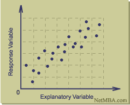
http://www.netmba.com/images/statistics/plot/scatter/scatterplot.gif

A scatterplot shows the data by using a collection of points. The points on the horizontal axis are the explantory variables and the ones on the vertical axis are the response variables.


Similarity Matrix


A similarity matrix shows the similarities or the difference in the variables that are being represented by the graph. This is a representation of a collection of 10 bacterial strains.

Correlation Matrix


http://yin.che.wisc.edu/images.htm

This is a representation of a correlation matrix of Phage T7 protiens. The correlation is shown with the color, red representing high and blue representing low. A correlation matrix is a matrix that shows the correlation between pairs of data.

Histograms


A histogram is a graphical display of tabulated frequencies shown as bars. Here is an example of a histogram. It doesnt represent any specific data but you can see by the picture that you can use these bars to represent any type of data.

Box Plot


http://edubuzz.org/blogs/nbhs3x1/2007/01/08/8-jan-2007-five-figure-summary-and-box-plots/

This is a very simple representation of a box plot, however the basic concept is shown by representing the numerical data which considers the data in 5 different summaries and is represented in the lower quartile, the median, and the larger (Q1, Q2, Q3) box plot also may indicate any outliers which are outside of these quartiles.

Stem and Leaf Plot


A stem a leaf plot is a graph that is used to represent quantitative data in graphical format. It contains two columns seperated by a vertical line, the left side contains the stems and the right contains the leaves. This is shown the stem plot above as you can see the stems and the leafs are the reason it is called this.


Star Plots


A Star plot is a chart that displays multivariate observation with a number of variables, since the observation is represented as a star shaped figure with a ray for each variable it is called a star plot. This is star plot shows the 12 numeric variables in the automobiles data.

DOQQ


This is digital orthophoto quarter-quadrangle (DOQQ) program in North Carolina, it is an image that is computer generated of an aerial photograph.


DEM

http://eros.usgs.gov/images/dem.jpg


DEM stands for Digital elevation models which is a digital representation of ground surface topography. It can be represented as a raster, or triangular irregular network. This is a 7.5 minute DEM (Sturgis, SD)

DLG


DLG stands for Digital Line Graphs which are digital vector representations of cartographich information derviced from USGS maps and related sources. This is a DLG of Beaufort, SC.

DRG


DRG stands for digital raster graphic and is a scanned image of USGS (U.S. Geological Survey) topographic maps for us on a computer. The newly scanned image is the raster image and usually includes the original border information. The above map is a representation of a DRG.

Isopachs


Isopachs are lines that show and connect the points of equal thickness. They are able to portray the stratigraphic thickness of the rock. This map shows the thickness in feet of the Tully Limestone, with the isopachs of the Moscow Shale which are shown with the heavy blue lines.


Isohyets


In this map the Isohyets show average annual rainfall (mm) for stations with more than 20 years of records. Isohyets are lines that show the equal amounts of rainfall. Just like isotachs show where the wind is constant, Isohyets show where the rainfall is constant.

Isotachs


This map has istoachs which are lines that represent where the speed of the wind is constant. They are shown on the surfaces of constant elevation or atmospheric pressure. This is a map that shows the wind direction and speed across the area.

Isobars


http://www.newmediastudio.org/DataDiscovery/Hurr_ED_Center/Hurr_Structure_Energetics/Closed_Isobars/Closed_Isobars_fig02.jpg

This is a map with Isobars which are lines of equal or constant atmospheric pressure drawn on a meteorological map. You can see here the white lines are Isobars and show the pressure measured in millibars.

LIDAR


LIDAR ( Light Detection and Ranging) is a form of optical remote sensing. It uses a type of laser, or scattered light to find the range and information to create the image. This image was created by the use of a LIDAR.

Doppler Radar


This is a representation of the Orlando area in FL using the Doppler radar. The Doppler radar is a radar that uses the doppler effect in order to produce data about objects that are in the distance. It is used in air defense, air traffic control, radiology, and in detecting tornados.

Black and White Aerial photo

http://freegeographytools.com/wp-content/uploads/2007/09/doq-thumb.jpg

A Black and White Aerial Photo portrayed in black and white by using different emulsions. It is said that the masses are emitted into wavelengths.

Infrared Aerial photo


This is an infrared aerial photo of Miami Florida. Infrared aerial photo is a photo that is taken usually by satellites, and are used as tools in order to study the land. The colored is deteremined by the infrared light.

Cartographic animation


In this image, the animation of the change in precipitation is shown. Cartographic animation in order to show the depiction of change, or movement. Since it is an animation it is usually portrayed on electronic devices such as a computer, or a projector device. It is easier sometimes to view the change through the animation.

Statistical Map


A statistical map is a type of map is where information is represented by numerical values. In this map the values represent the number of Presbyteries missions located in the United States.


Cartogram Map


http://proceedings.esri.com/library/userconf/proc99/proceed/papers/pap489/p4892.gif

There are two types of Cartogram Maps, there is area and distance. "A cartogram is a type of graphic that depicts attributes of geographic objects as the object's area." This map is a cartogram of the US population in 1990.

Flow Map


This is an example of a Traffic Flow map that the University of Kentucky created for Game Days. There are different examples of flow maps such as a social network map, or an air travel map. Flow maps show the idealized route that should be taken in different situations.

Isoline Map


www.indiemaps.com/blog

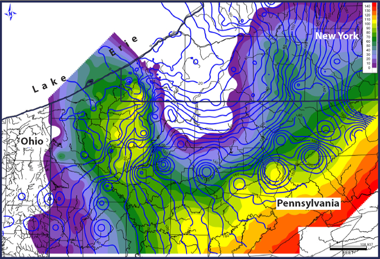
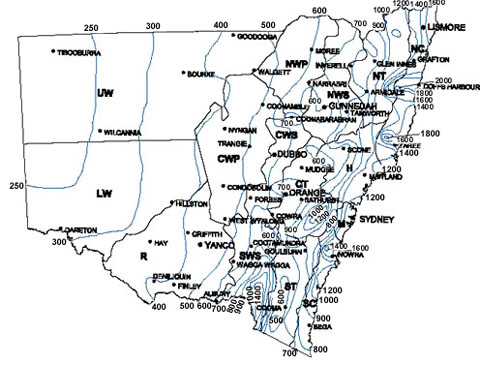
This is an isoline map of the tempature acroos the U.S. Isloine maps use continous lines that join points of the same value. Even though they can be used to represent any type of data they are usually used for tempature, the different colors represent the temperature changing in the area.

Proportional Circle Map


https://blogger.googleusercontent.com/img/b/R29vZ2xl/AVvXsEg6_U5DKy6jQ3r87qw_wKTBFCOSeYgOxlJCN6lq9aAUJseTE3bZYGtAyAhPcVCaqfCLOaWzGvKO__tkOOvE08w-sNpRCJCHXc9pVlTWRU1Rk1o-SVUoWY3Ao_5tWOv1e075leFn_2jUWkCw/s1600-h/6a00d83451c0c869e200e54f96094e8834-800wi.png

Here is an example of a Proportional Circle map, this map represents the size of farm subsidies in the Manhattan area. The mapper can choose from any shape, or symbol but since this is a Proportional Circle map, you use a circle which represents the proportion of the quantities of the data your are mapping.

Choropleth Map


This is a Choropleth map that shows the election of 2008 divided by Democrats and Republicans. Choropleth Maps is where areas are shaded or pattern in different ways in order to represent statistical information.


Dot Distribution Map

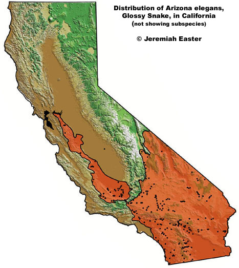
http://www.californiaherps.com/snakes/maps/aelegansmapjeaster.jpg

This is a representation of a Dot Distribution Map, this is a map of California and the dots are a representation of the Arizona elegans which a Glossy snake that lives in California. As you can see on the map the number of dots represents the quantity of these snakes in the region.

Propaganda Map

http://www.hispanicad.com/blog/?attachment_id=56

This is a propaganda map used towards Hispanics, as you can see Mexico is represented bigger then it really it in order to attract Hispanics to the brand.


Hypsometric Map

http://www.reliefshading.com/zoomify/FranceLeuzinger.html

This is a Hypsometric map of France, it shows the representation of the elevation of the area with colors. This type of map shows elevation by color, contours, shading, and tinting.

PLSS Map

http://www.kitsapgov.com/gis/maplibrary/parcels/plss_reference_l.png

This is a PLSS (Public Land Survey System) of Kitsap County in Washington. PLSS is used to subdivide and describe the land, this specific map shows the tax ownership, major roads and highways and the PLSS boundaries in the area.

Cadastral Map

www.dalisproject.org/pages/findMapsheet.aspx

This is a cadastral map of Delaware county it shows the boundries of the land. In this cadastral map it includes additional details such as the district names of the area.

Thematic Map


http://www.lib.utexas.edu/maps/atlas_mexico/vegetation.jpg

Above is a thematic map that reflects the vegetation in Mexico. This map portrays the agriculture in the country.

Planimetric Map


This is an example of a planimetric map, it is a map of Portland and it shows the horizontal position of features in the area but does not show any vertical postions such as a topographic map.

Topographic map


geography.unco.edu/jdoerner/GEOG274/map.htm

This is an example of a topographic map from the Appalachians. It shows the representation of relief, using contour lines. Features that are natural and man made are shown in the this map, Notice the water gap through Haystack mountain.

Mental Map


Shown above is a mental map of what Coloradoan's think of their state. It is percieved that Coloradoan's see there state divided into these 7 regions which include the "Western Slope, The Mountains, The Front Range, The Foothills, Front Range Urban area, The plains, and the San Luis Valley." Each of these regions have meaning to Coloradoan's because they see them not only as geographic differences but differences that affect their daily activies, for example which region is ideal for certain outdoor activities such as skiing, and other water sports.